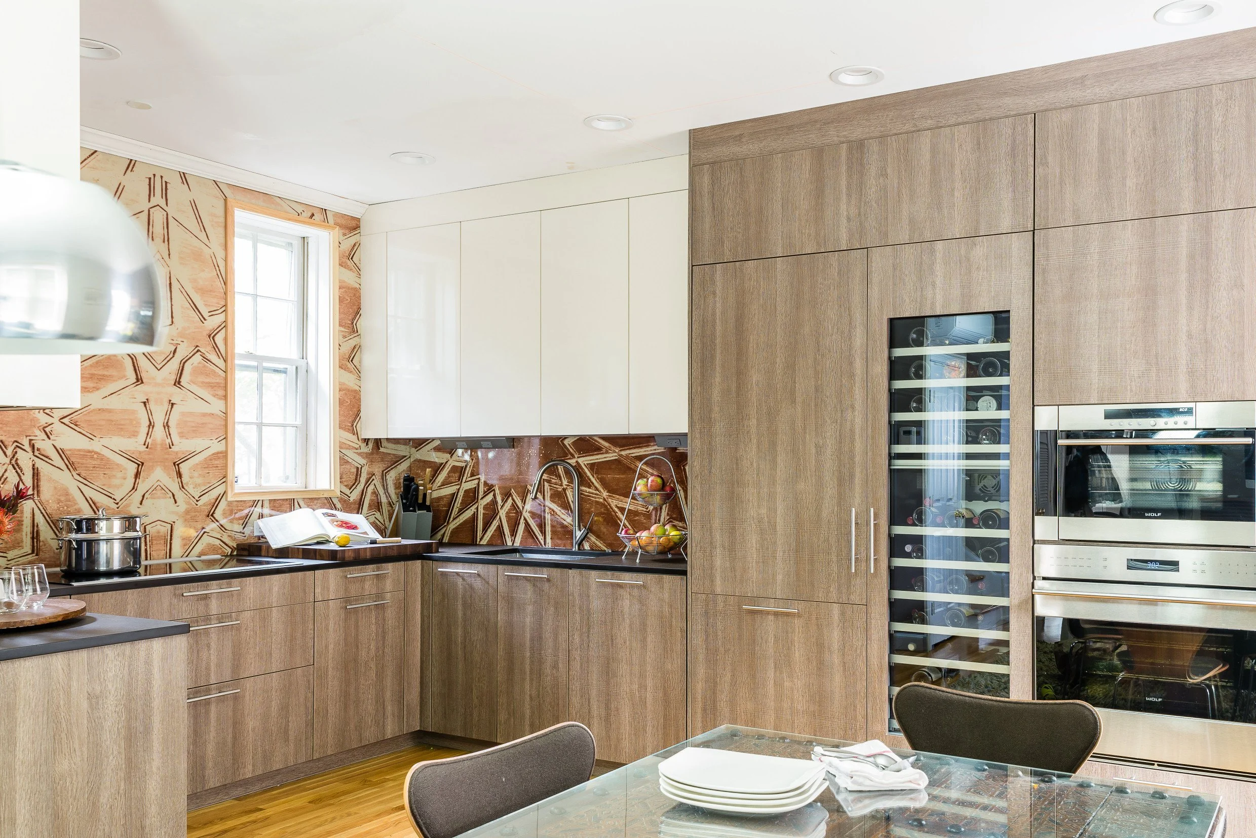
BOSTON LIGHT AND BRIGHT TRANSITIONAL KITCHEN GREY ISLAND
Clean lines with transitional ties
Meet Michael Hanna...
Or rather, Meet Egypt's most promising architect/designer. Michael's style and tastes are eclectic, yet his ability to maintain minimalist theories is what sets him above the rest. In Michael's scope of work, the Divine Design + Build designer proves his artistic chutzpah with a number of signature "moves". Case in point, a striking introduction of red, animal wallpaper on an accent wall, or curious kitchen islands that shape and snake in strange and lust-worthy ways. However, with this in mind, Michael's ability to incorporate sophisticated back splashes into white-on-white, modern kitchens is unfounded in his contemporaries. To have a home touched with the artistry of Michael Hanna, is to step into the utmost of luxury--- with every detail designed for. And, of course, this transitional kitchen is no different...
Sad dog, happy dog
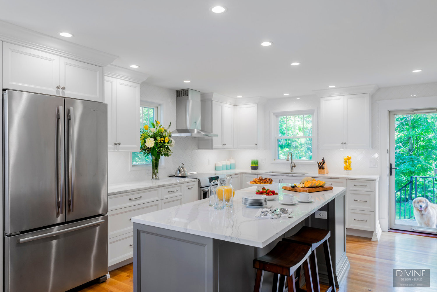
Animals can tell you a lot. And, based on this after, before--- before and after, this dog's adorable mug is telling us all one thing: this kitchen's facelift is a serious improvement. Especially in boosting the household morale. Dingy cremes plus faux-finished floors and cabinetry created a dated space. The original kitchen relished the 1980's in every kind of wrong. But, let's be honest...were the 1980's really very good at design to begin with? So, as expected, Michael and his "Divine" team faced the first challenge -- peeling it all back.
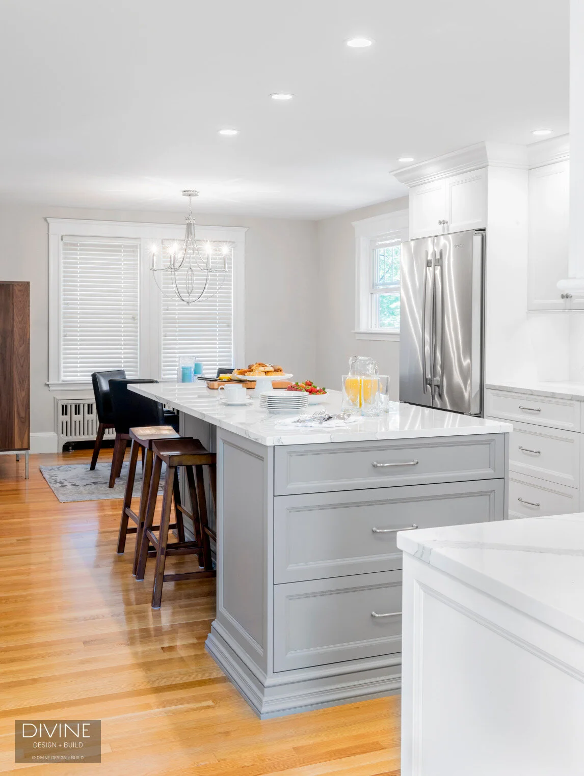
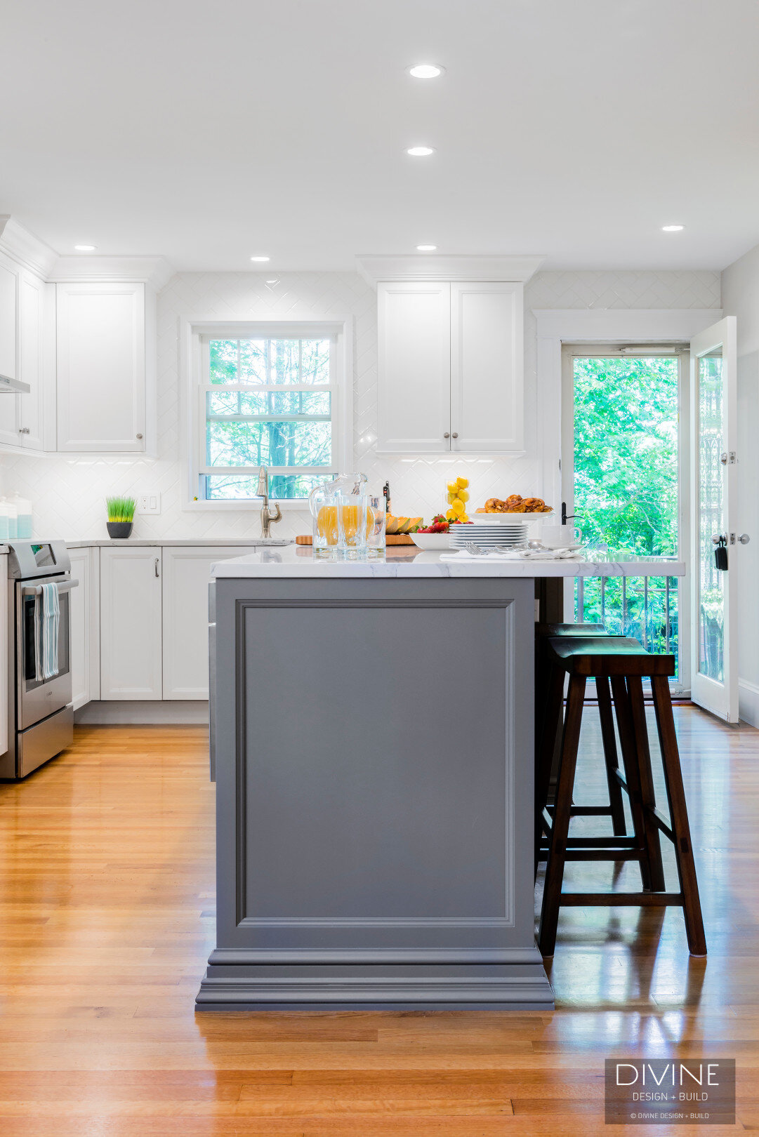
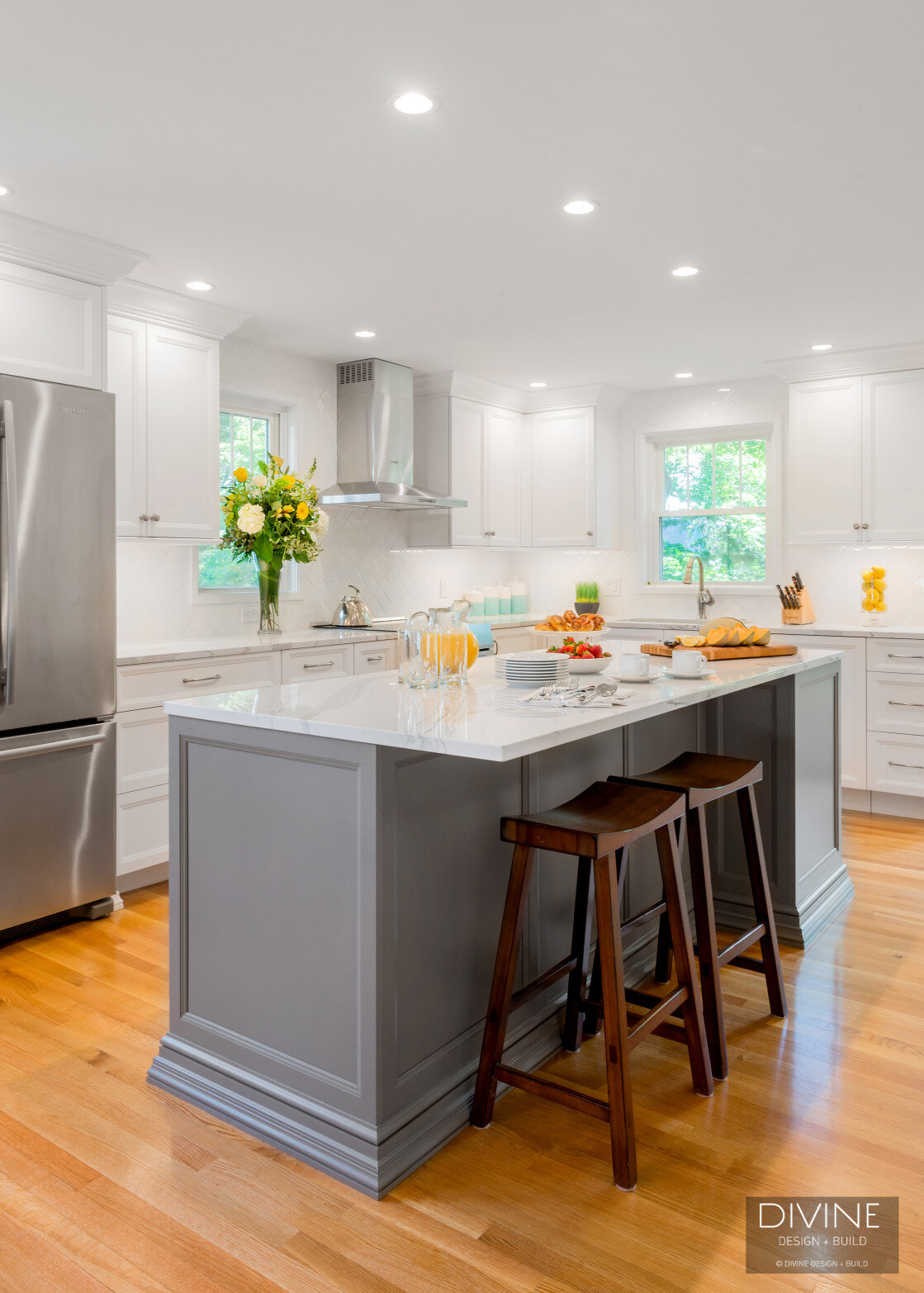
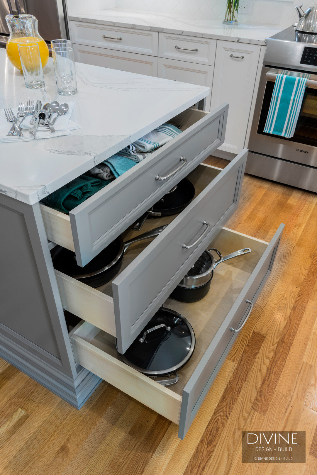
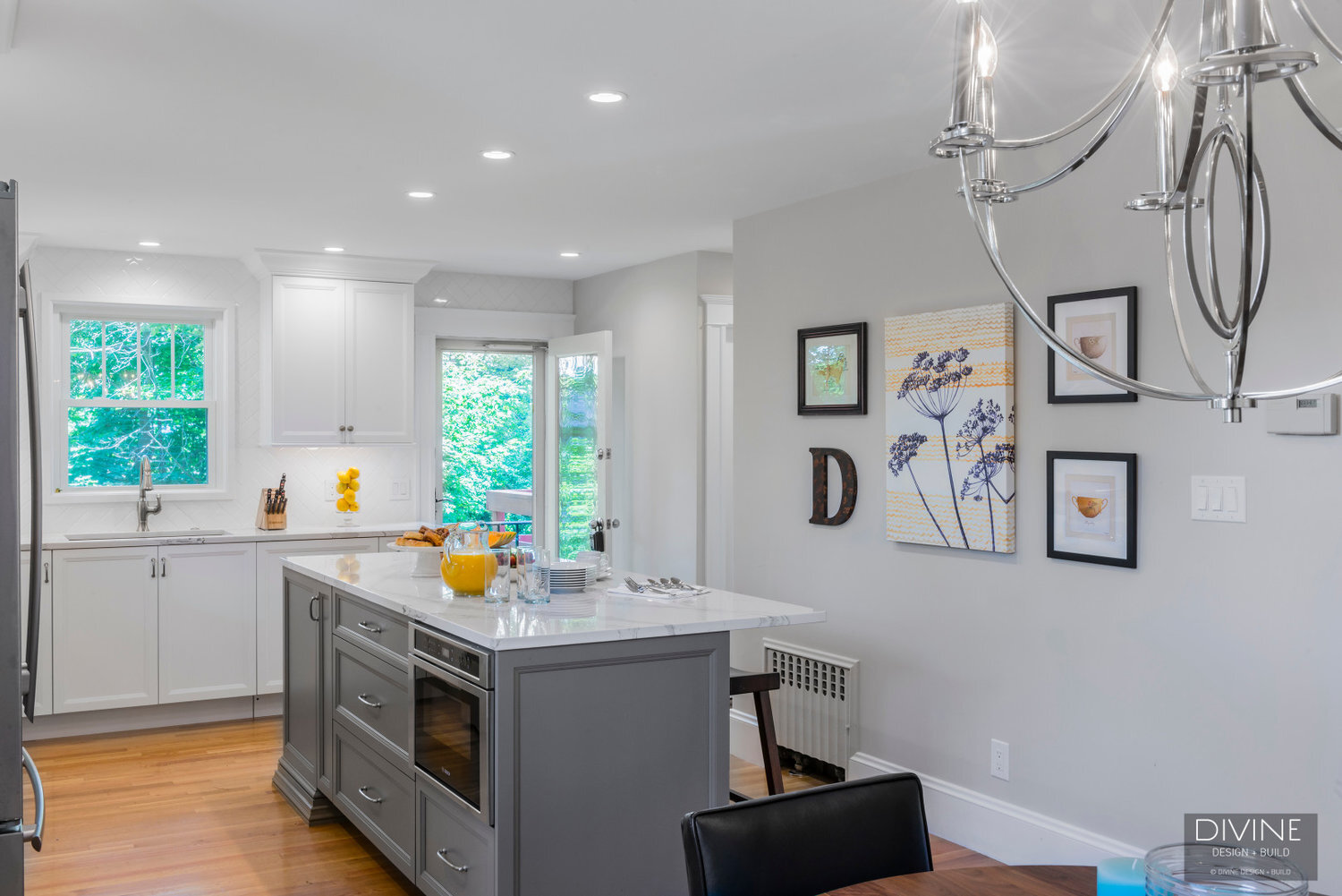
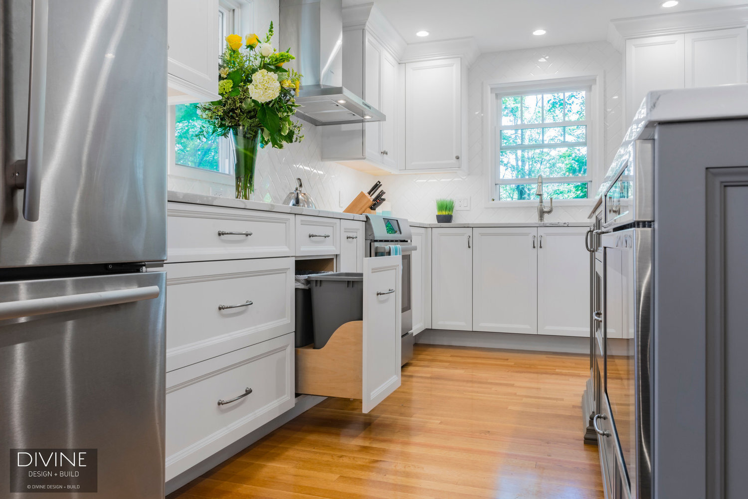
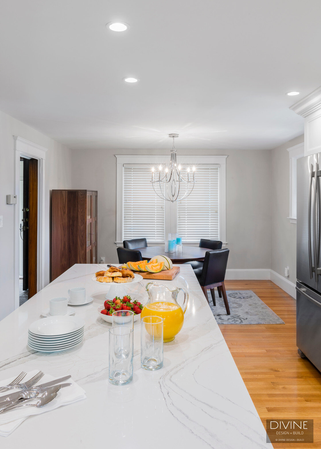
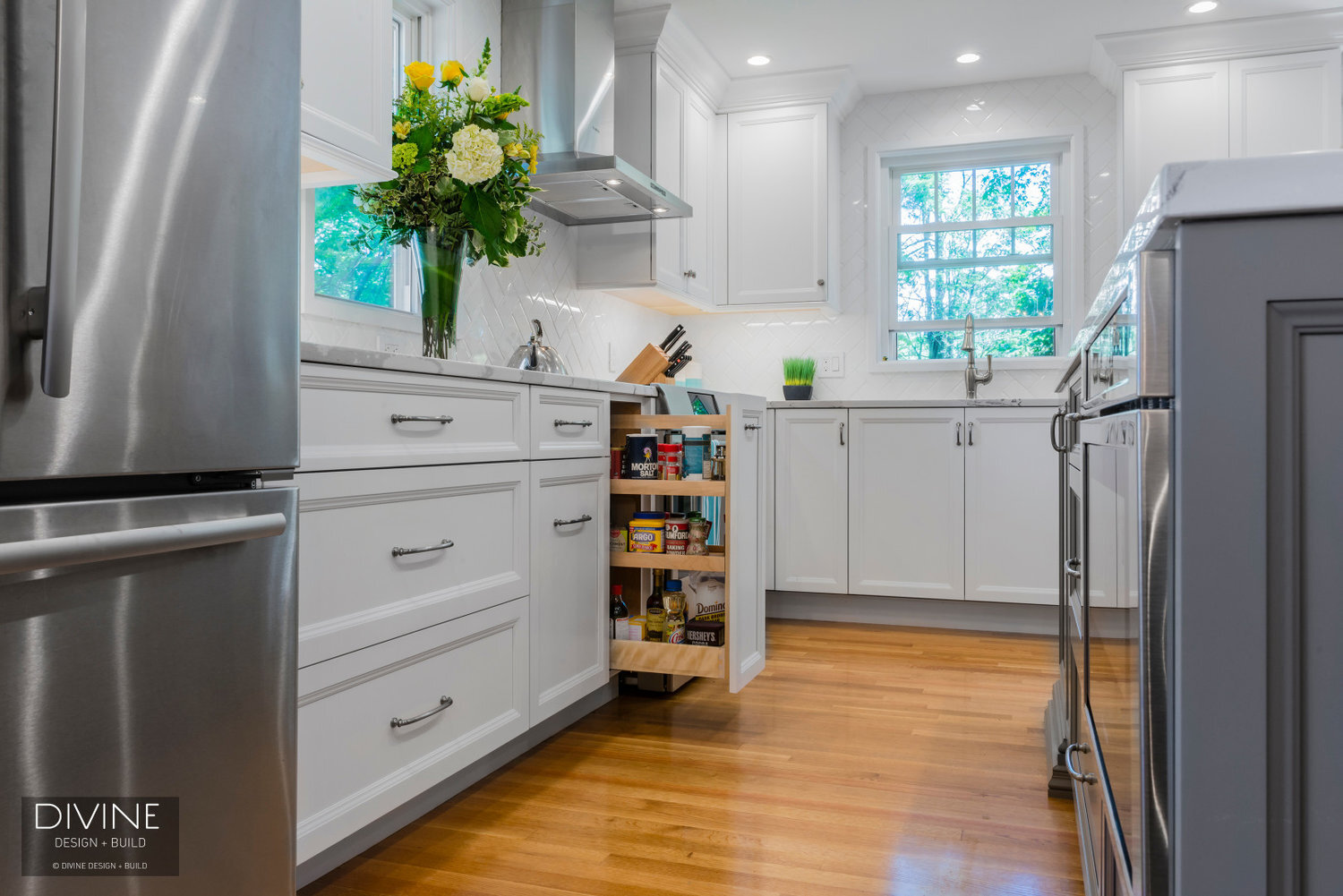
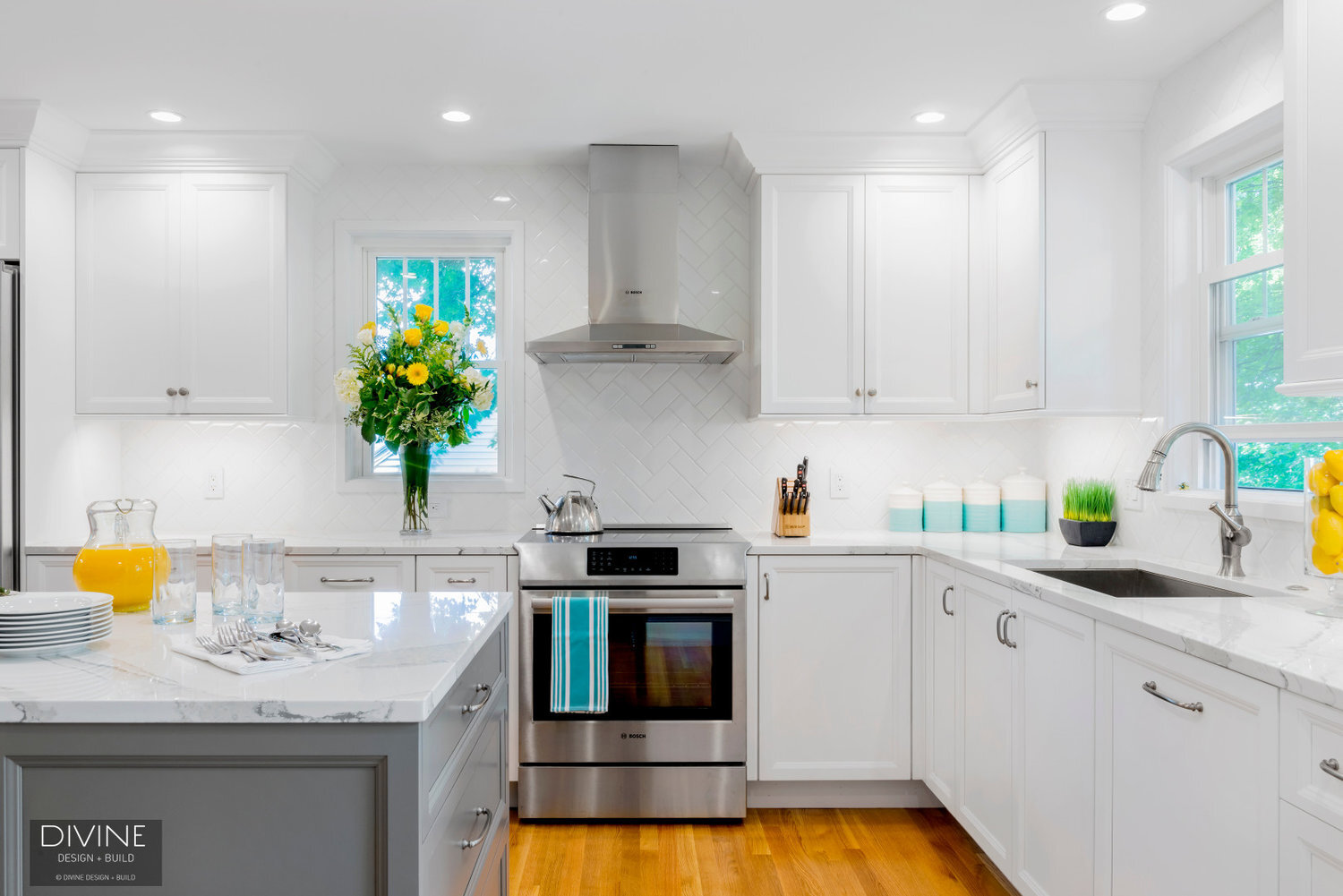
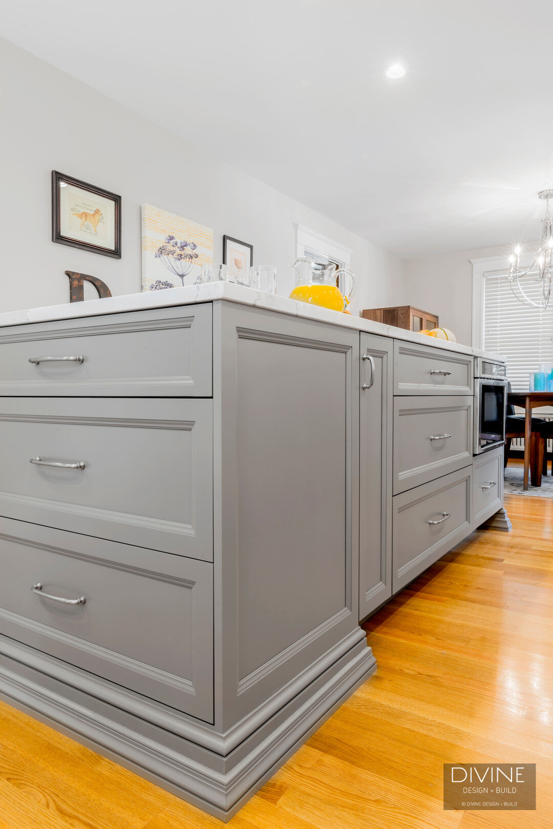
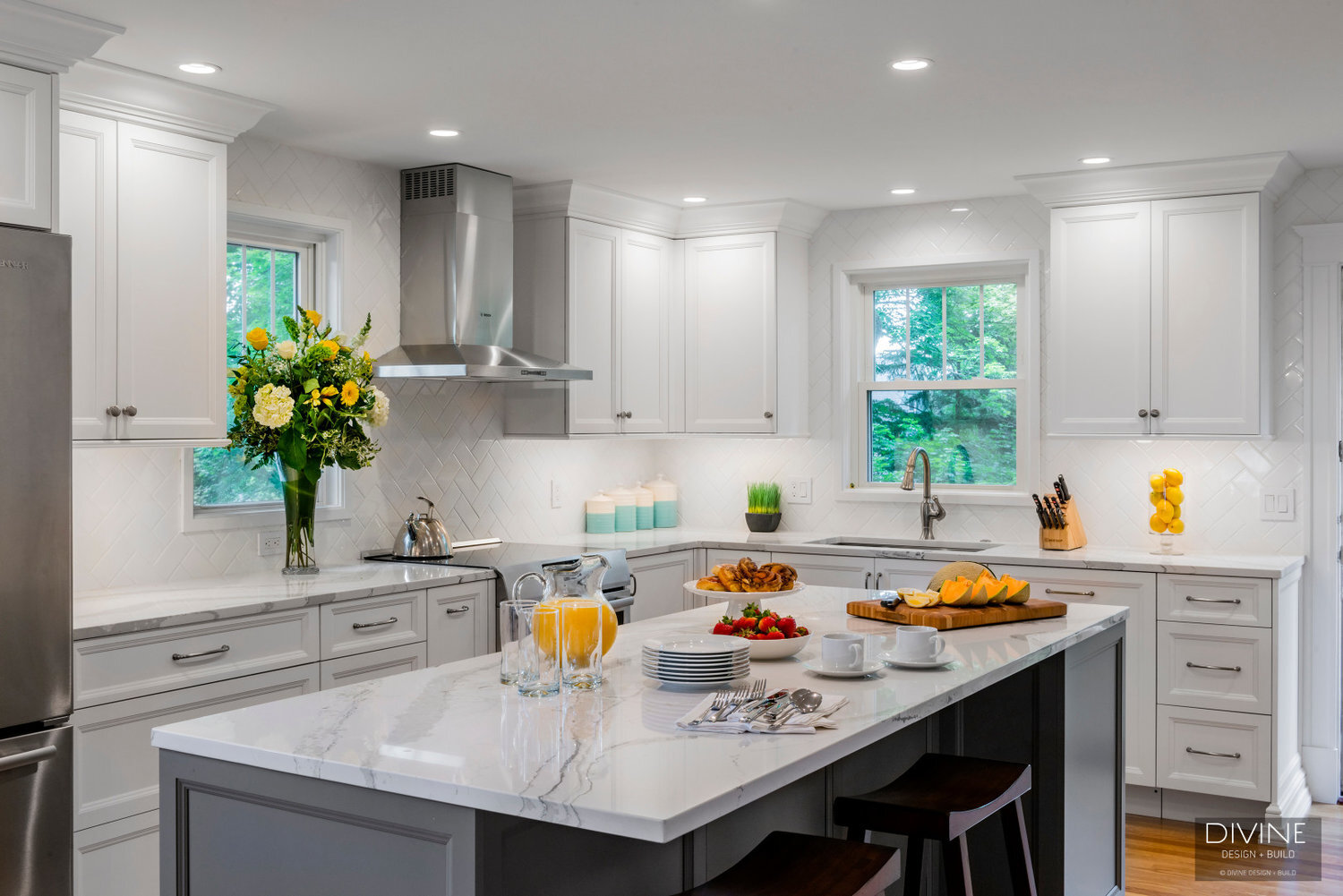
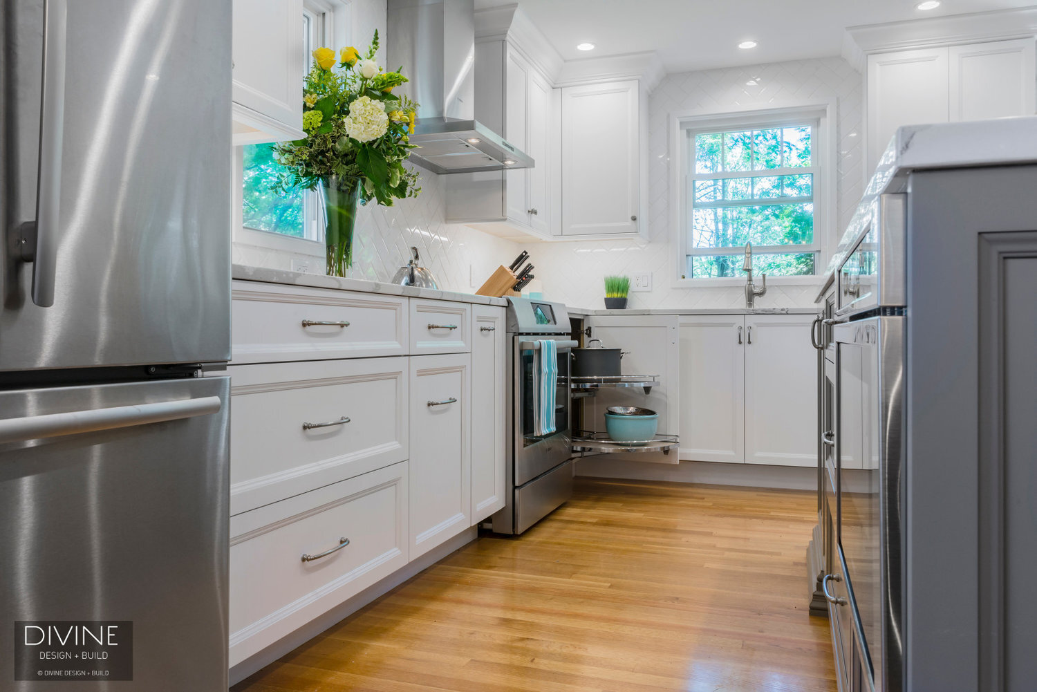
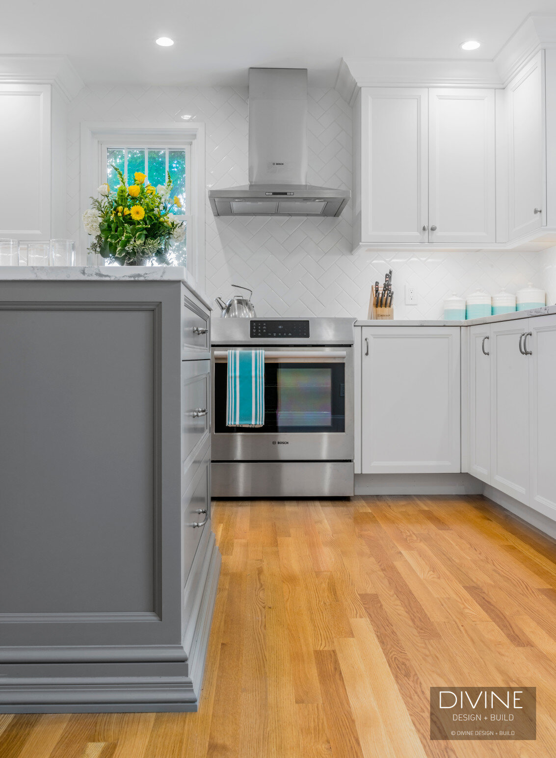
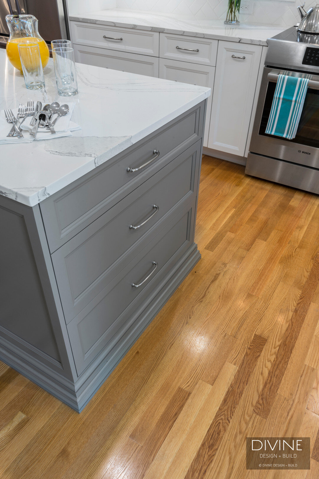
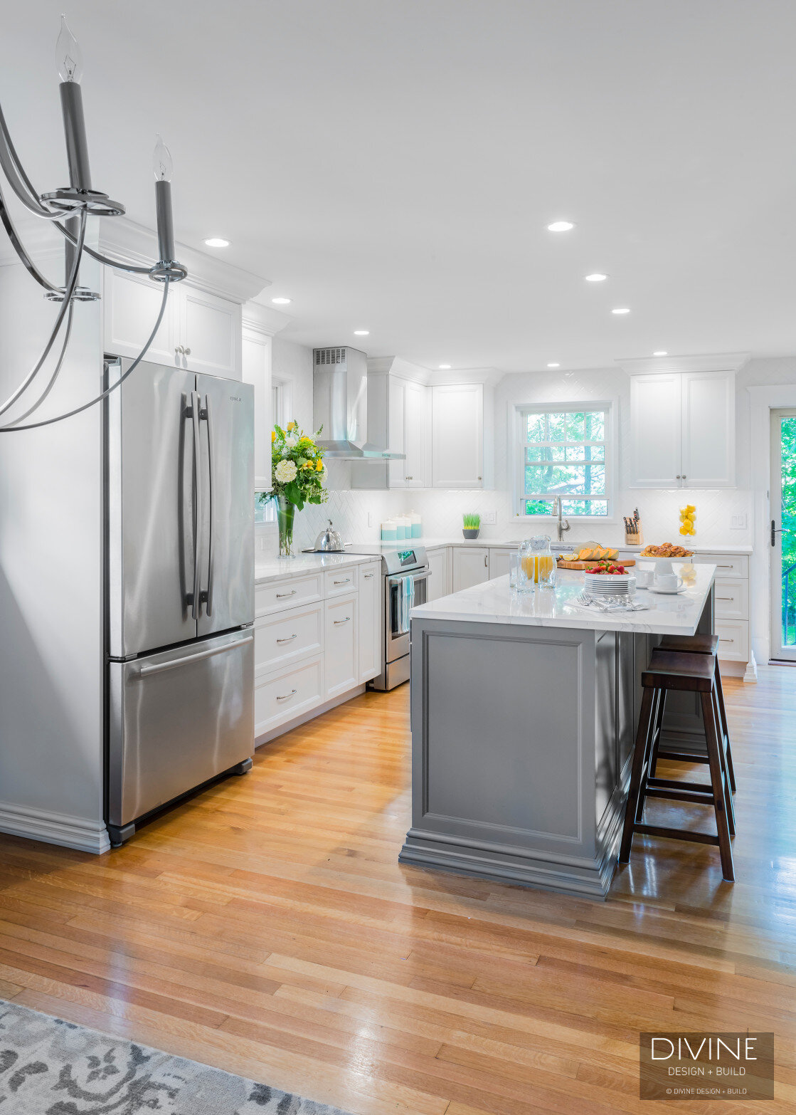
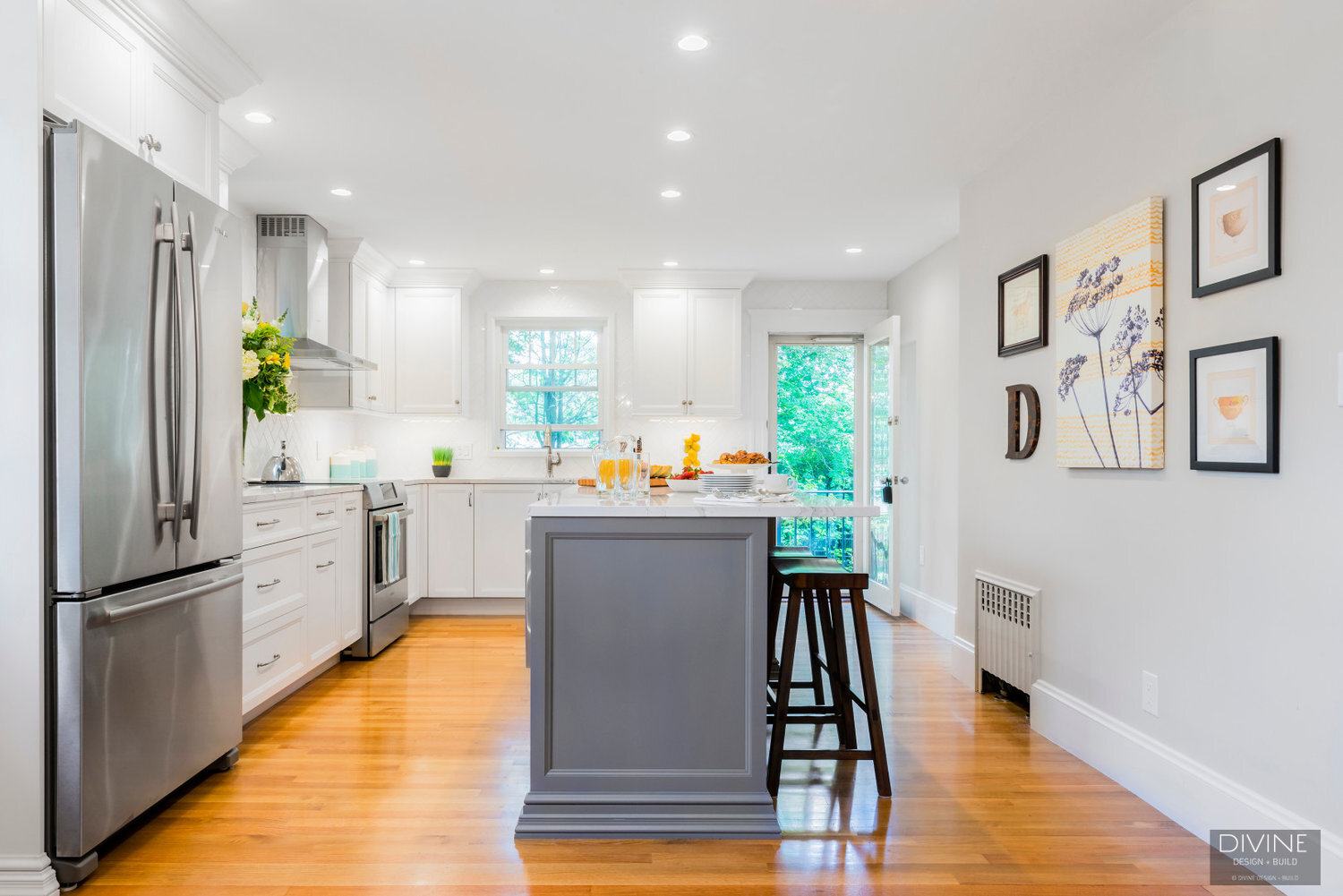
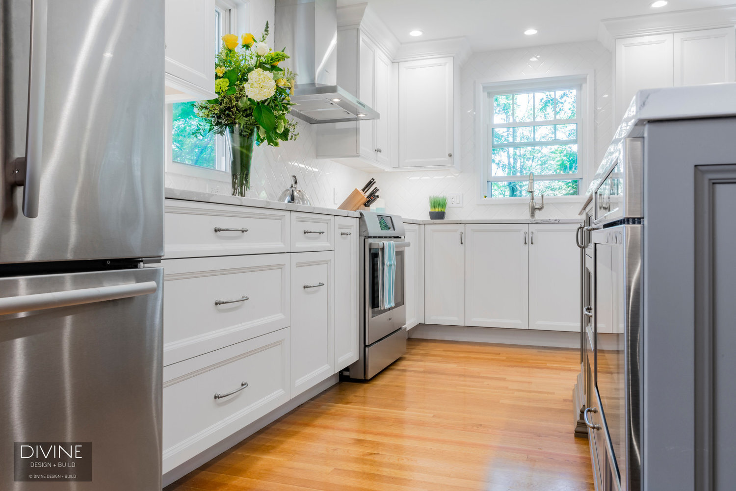
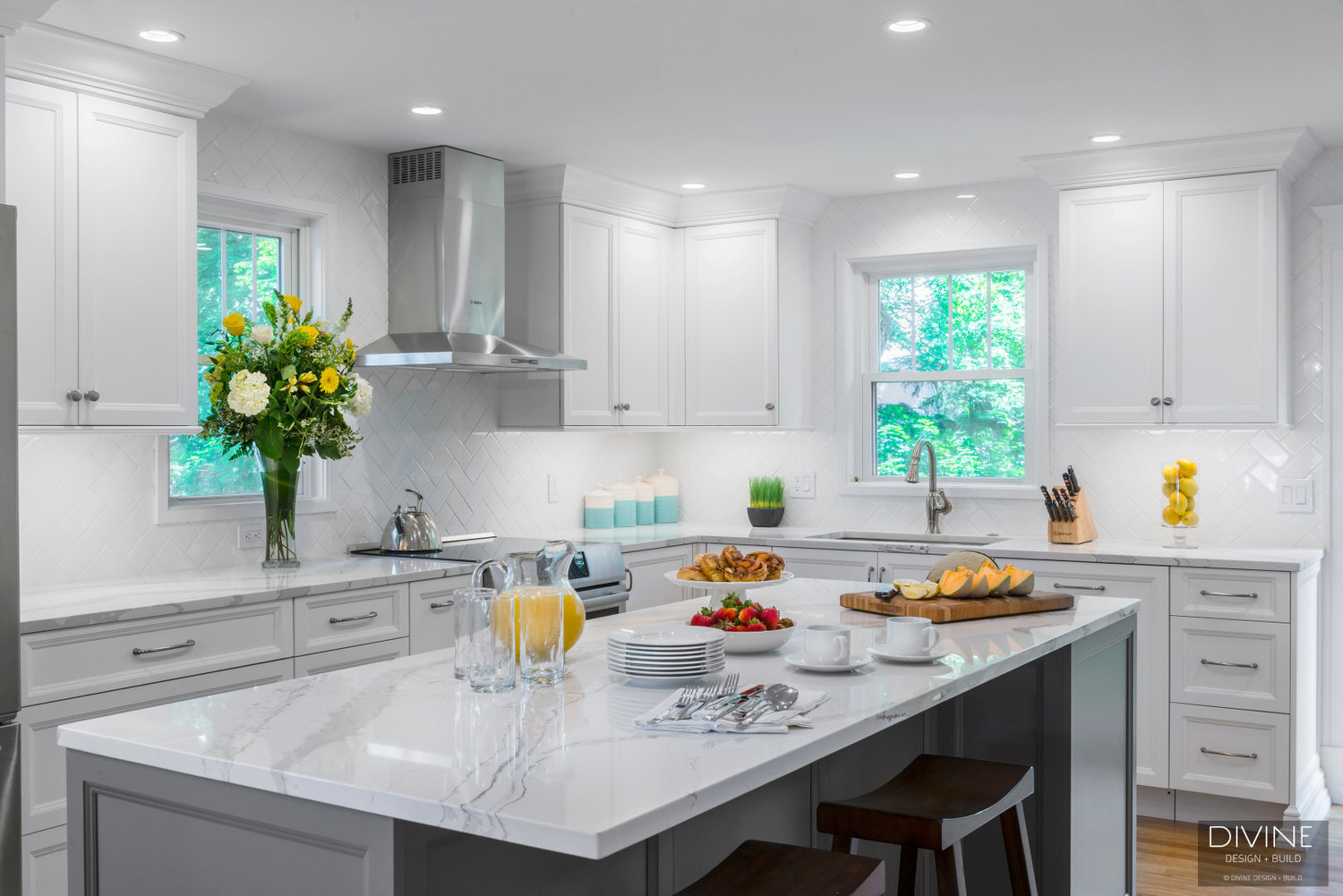
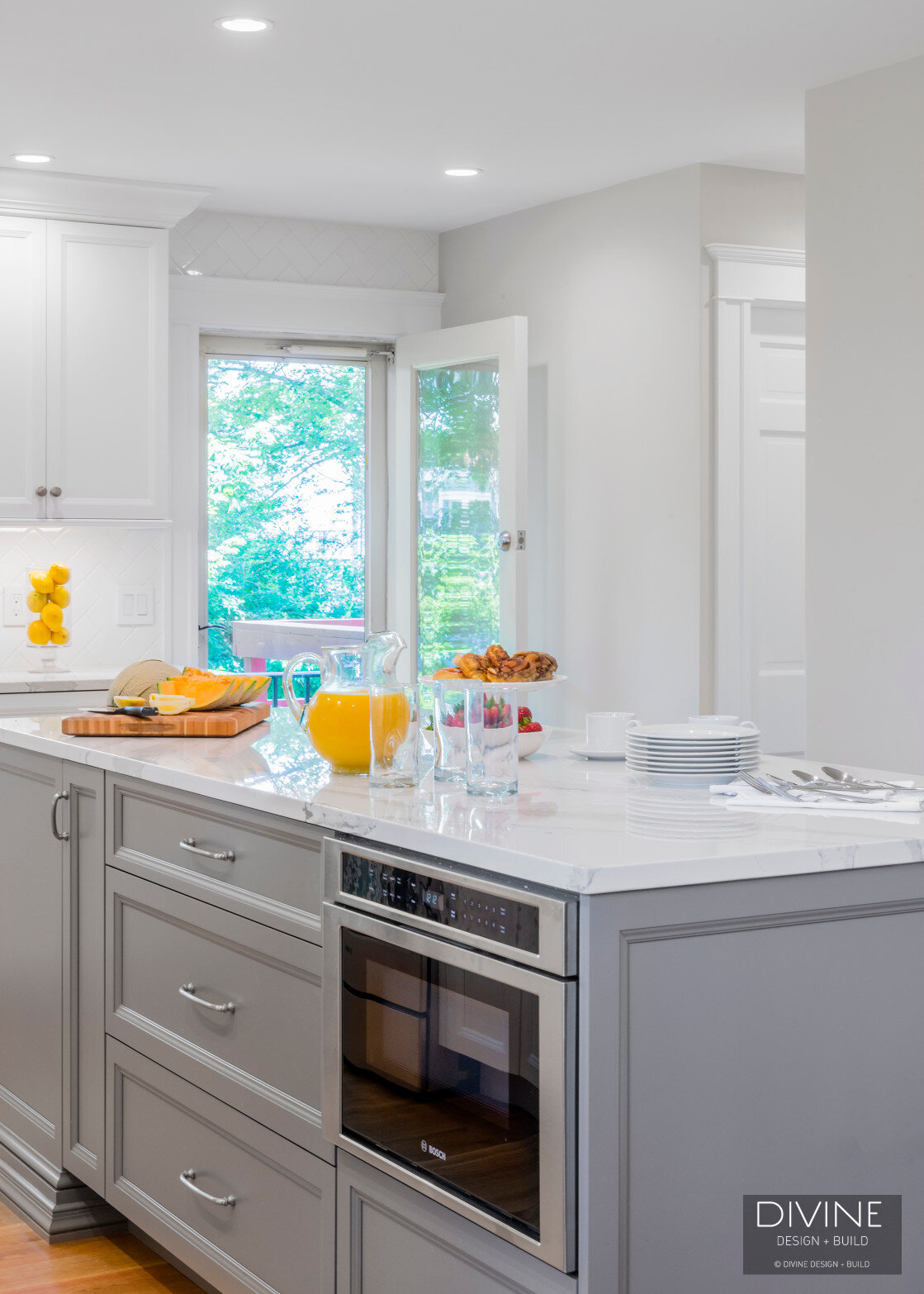
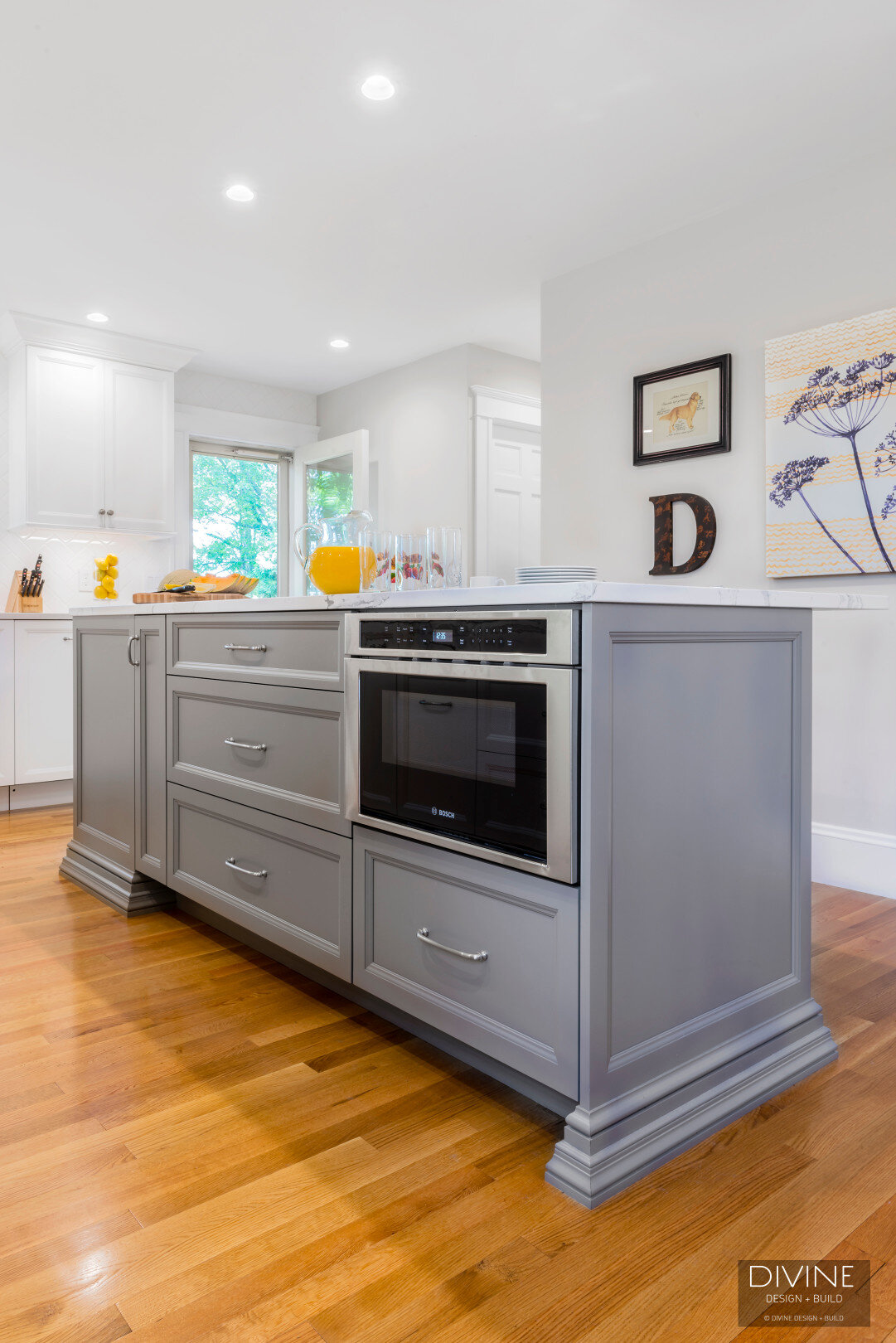
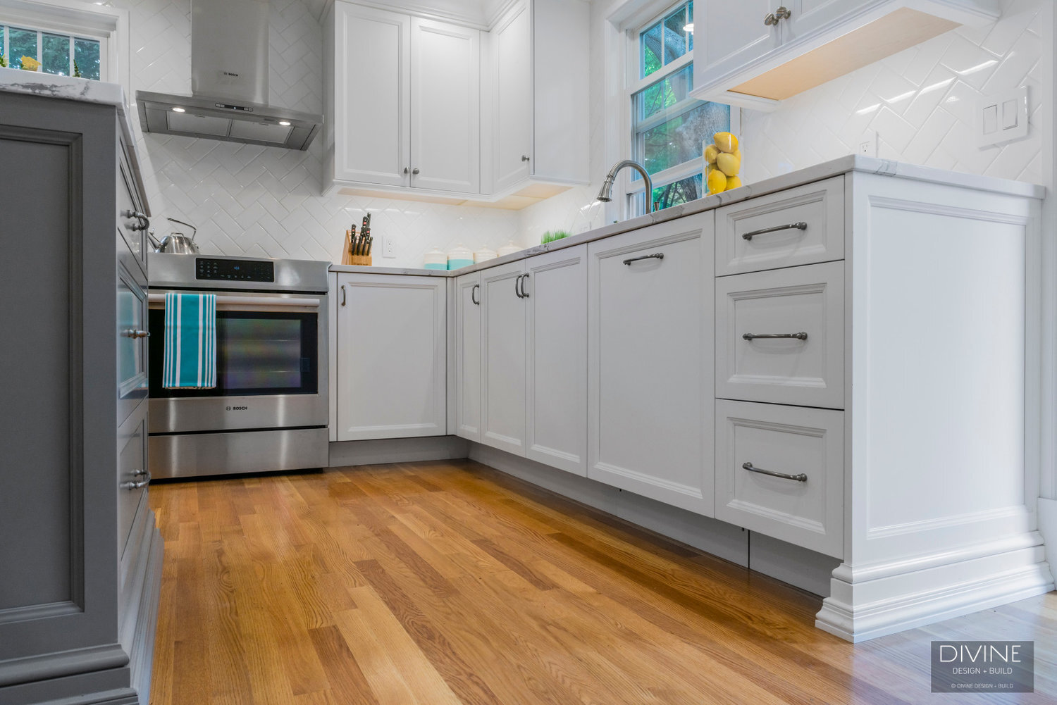
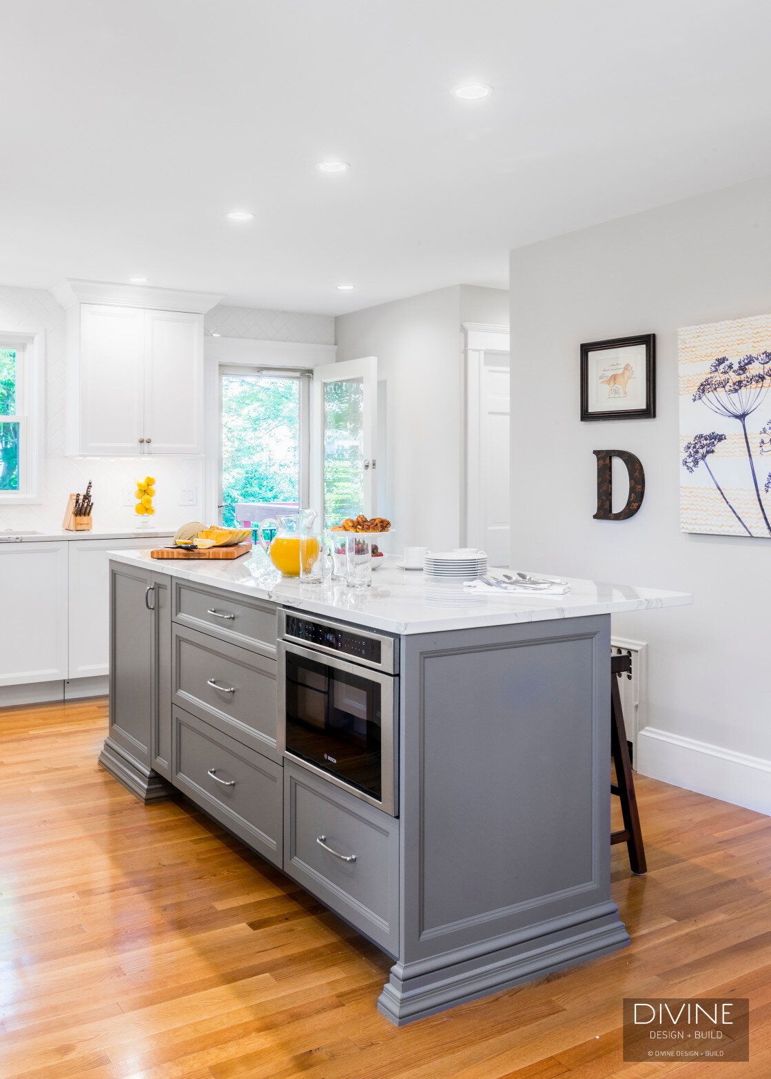
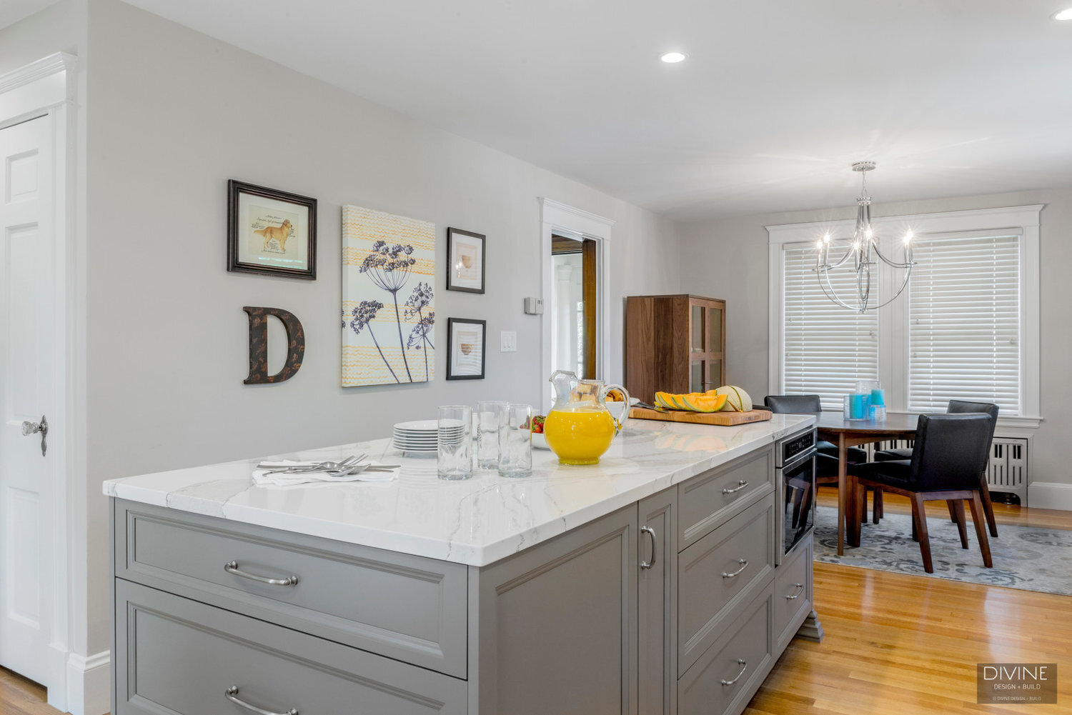
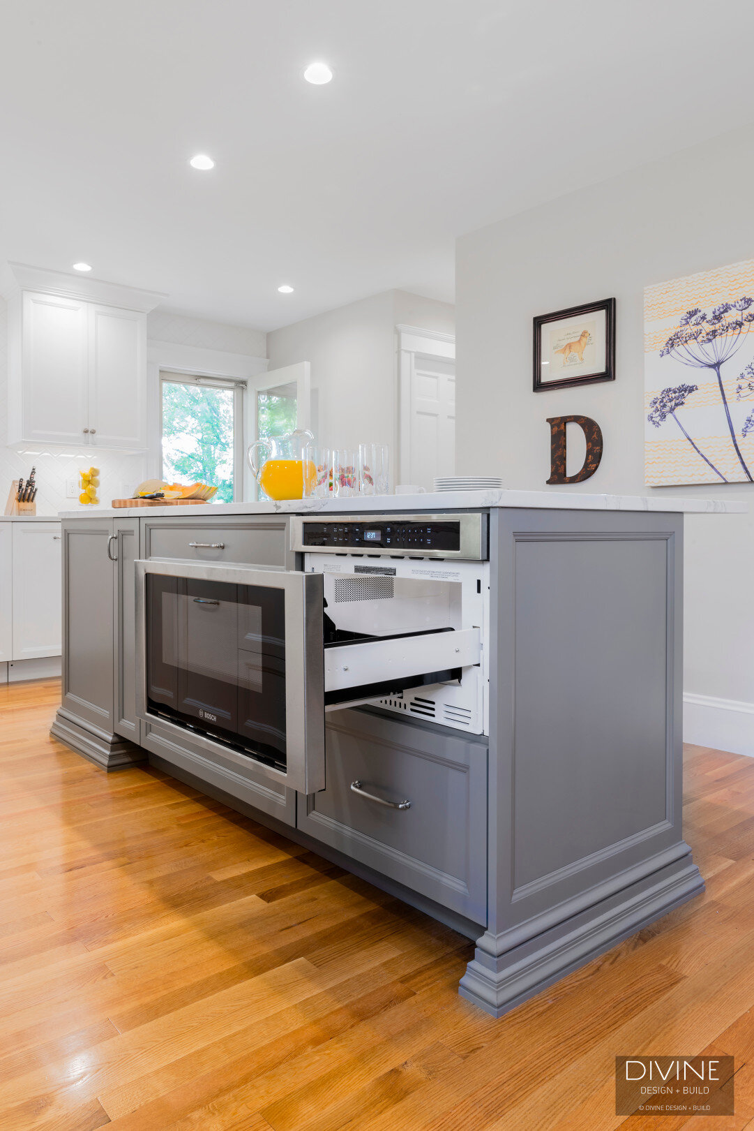
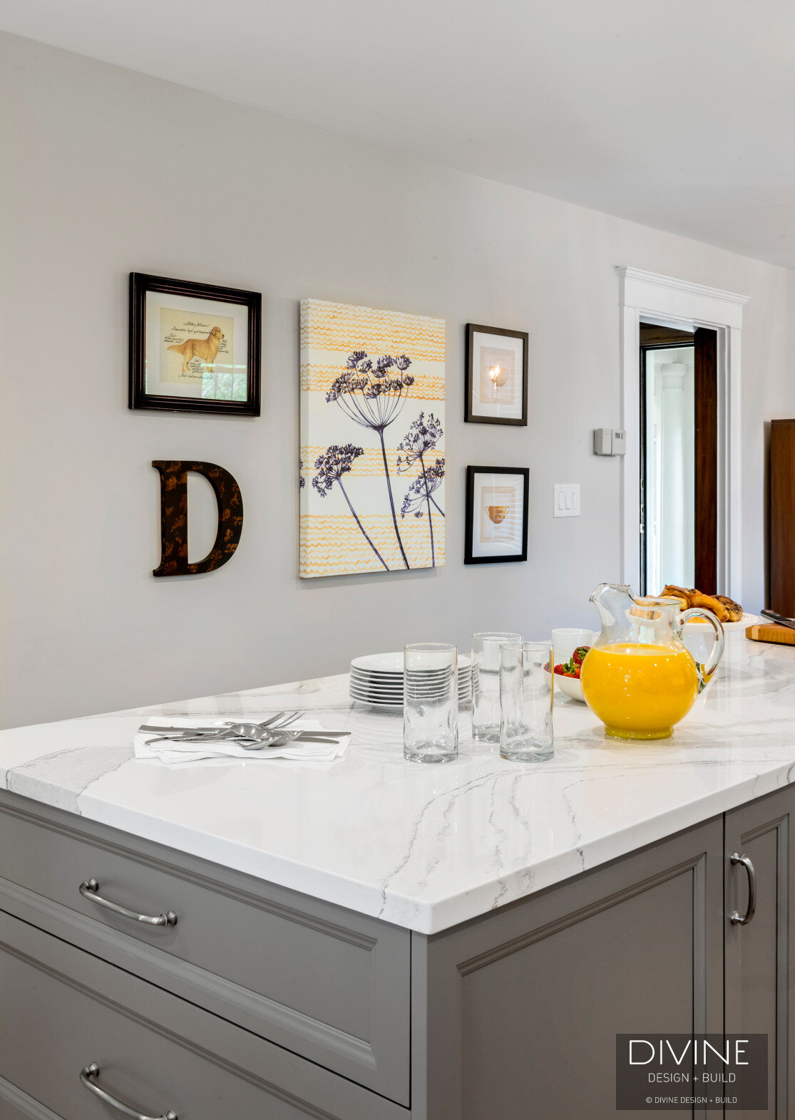
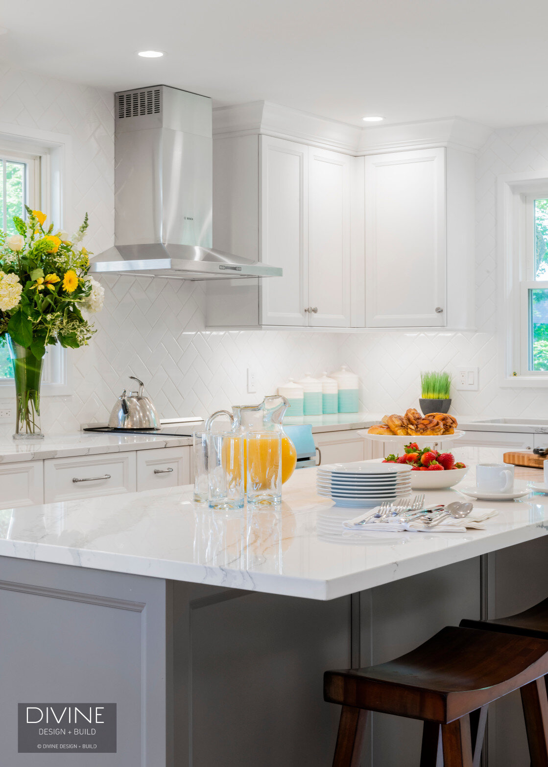
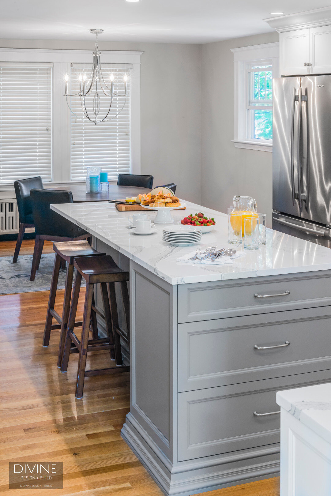
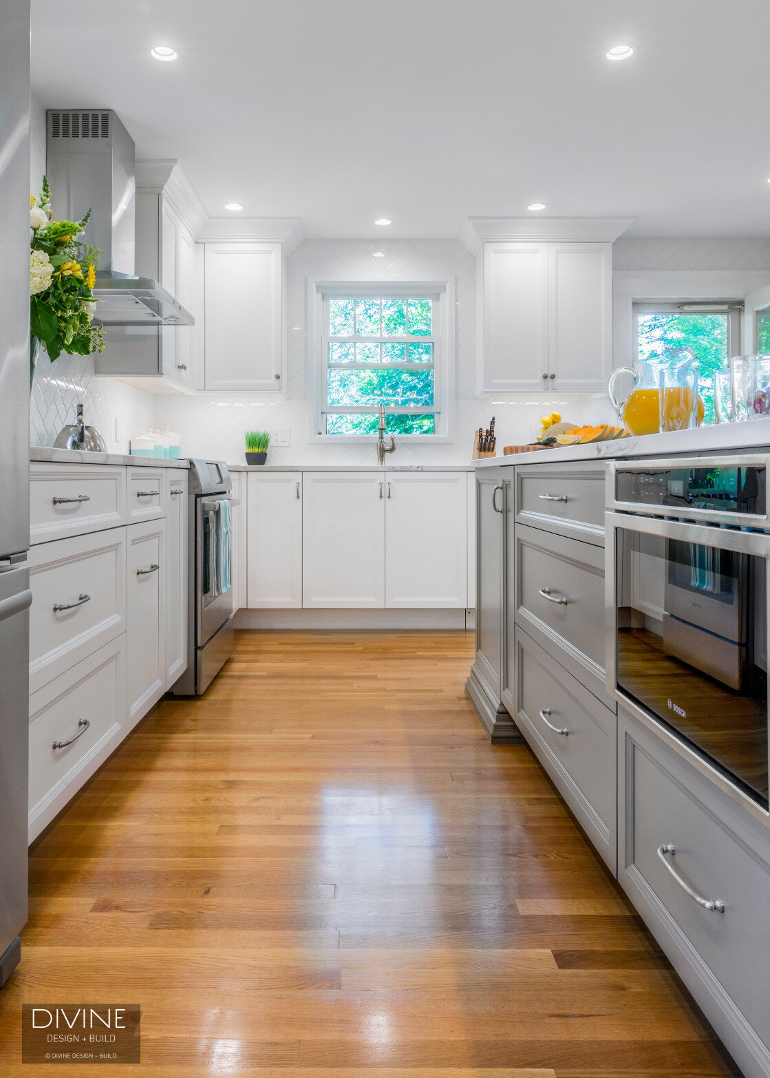
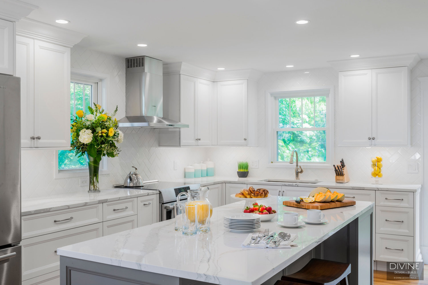
The final result is undeniably spectacular. Michael's integration of white with subtle grey accents (like on the base of the island) opens up the kitchen, while also escaping the trials associating with "whitewashing". While white is upheld, and minimalism is gained, texture plays a redound role in spicing this kitchen up (without the use of red pepper flakes, and etc. wink). A herringbone tile backsplash, mixed with an engineered Cambria counter-top eradicates this kitchen from the norm. The kitchen island's juxtaposing soft, yet grotesque features in the material hi-light a much-needed breath of fresh air.
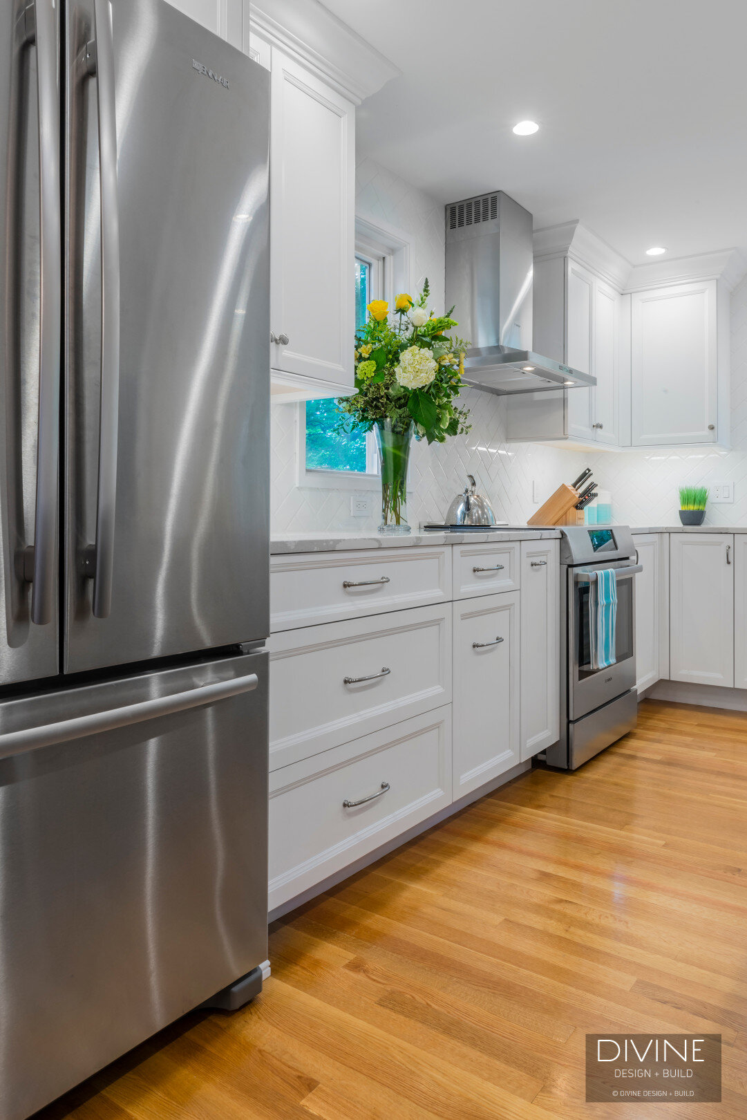
Similarly, the stainless steel appliances from Bosch, and Brizo + Atlas accessories add depth and sheen to the white-centric space.
Additionally, the designer's choice in medium to light hardwood floors create notes of glossy, shine with movement in the wood's own structure. Space feels as if it is breathing...breathing in fresh air and sunshine.
recessed lighting adds to the minimalist elements enacted throughout the space, while the white cabinets from Hampshire cabinetry similarly open up space further.
Beautiful designs from a spectacularly adept designer.
~Madison Silvers


