CAMBRIDGE CONTEMPORARY MODERN BLACK LEICHT KITCHEN IN VICTORIAN
Done right, black and white in Cambridge MA
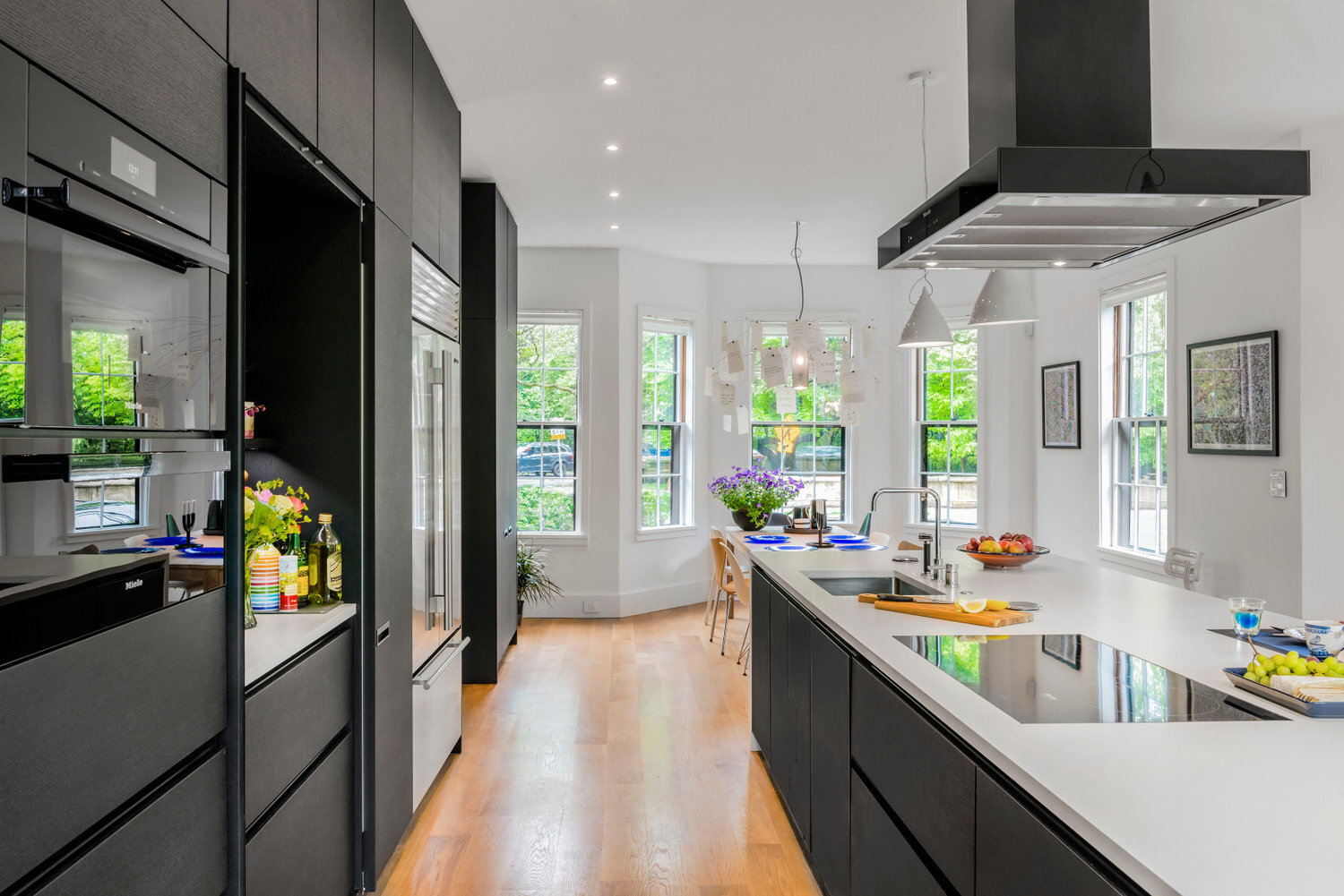
Stop and stare (as if you didn't already). The best in German engineering is at your front door. Or rather, your computer screen. LEICHT Kitchens, leaders and innovators in kitchen design provide this Cambridge home the set-up of it's dreams. Divine Design worked with LEICHT in providing understated luxury with timeless appeal. The LEICHT cabinetry is a textured oak with horizontal graining. But, foremost these built-ins' are finish with palatial esteem. The rich, opulent black stain on the quality oak mixes undividedly. Hence, the stain and oak provide iambic pleasures, and robust textures unfounded in the average cabinet.Other modern treasures found in this and the typical LEICHT kitchen are motion-censored interior, under-cabinet lights, activated with the simple act of an open or pull.We're sure you may be wondering...where are the handles, pulls and knobs. How can we activate the interior lights, in the middle of the night, when we're looking for the spoon to use for our midnight ice cream (shh)? How? How? How?It's simple; press gently on the front of the cabinet (only one finger required), and like magic, or genius engineering really, the drawer, or door opens out. Press a small button, and it automatically will close too. Additionally, certain components of the kitchen, like the dishwasher, require a knock, knock, knock...and open sesame...or a parting of the red sea.
LEICHT HANDS-FREE CABINETRY, INNOVATIVE MODERN OUTLETS
When designing a "modern" or "contemporary" kitchen, one fundamental challenge is always in maintaining a clean, or minimal look. While traditional, or even transitional styles of design play off of mouldings, decorative nuances, or the ability to "accesorize", the modern style simply just doesn't accommodate any of that. Consequently, the modern design industry has had to take things into their own hands. From built-ins, to hands-free doors, to the most glaring issue of them all...what about kitchen OUTLETS?Let's be honest, outlets for the most part are ugly. Not only are they ugly, but they are clunky too. And to make matters even worse, building codes require a specific number of them, in specific places throughout the home, and yes the kitchen. This includes the kitchen island. And, no, we're not allowed to hide them under the overhang so that no one can see them. That's just, well, "not up to code".So, where do we go from here?Well, Doug Mockett and Company, INC, i.e. Mockett came up with the perfect solution for the kitchen island conundrum. Enter the POP-UP KITCHEN POWER GROMMET. This modern outlet provides seamless aesthetics with proven functionality. Thus, not only are design squabbles squashed in this modern Cambridge, MA renovation, but thanks to likes of Mockett and some, the integrity of modern design is maintained even in the kitchen.(More information on modern kitchen outlets can be found on our sister company's blog right HERE...go ahead, click it.)
A BLACK/MAGIC KITCHEN
It's not often that clients in the New England area opt for black in their future schematics. Tradition, understandably, is like an old dog. Not many attempts new tricks. So, why break the golden rule if it's not already broken? Hundred-year-old colonials in the Boston area tend to beg for a brighter, new life when in the renovation. The colonies did a lot for America, but floor planning was not their strong point. So, when offered the chance to breathe new breath into a closed-off kitchen, the fool-proof choice is white, white and more white. And, that always works. And, that always looks nice. And, retrospectively, white has reigned as king. But, perhaps a fallacy has come to surface. For, fear of "claustrophobic" qualities leads many designers awry. However, the clients of this Cambridge abode wanted to try something different from the rest. They wanted the polar opposite of the design trend. They wanted black.And, we wouldn't be the designers we pride ourselves on being if we didn't take a leap? Thus, Divine Design + Build and Divine Design Center put their heads together and delivered the best in modern kitchens...and the most surprising. While white, naturally, plays it's role in this kitchen renovation, it's really a supporting actor (or actress). The juxtaposition of the two polar hues creates depth and atmosphere, while the floor-to-ceiling black, oak built-in's lead any on-looker's eyes to a visual awe.The careful selection of white to black is evident in the designer's selection of a pale, concrete Caesarstone island countertop. The white aspect from the kitchen's island creates an air of open, forward movement. However, the black accented cabinetry at the base and the black range hood provide grounding, robust elements to the overall space. Similarly, Divine's opt for stainless steel appliance from Sub Zero and Miele provide shine and texture that break up space, while also adding a sense of depth not dissimilar to a hanging mirror in a small room.Ultimately, the owners of this Cambridge colonial were left with not just a black kitchen, but a magical one too.~Madison Silvers


